
Making Conversational AI Feel More Human.
KINDRED

My Role
UX Designer | UX Research Lead
Project Type
Client Project: Pre-launched
Timeline & Methods
3 Weeks Agile Sprint, MSCOW, Persona, Mid-Fidelity
Client Challenge
Solution
1 Discover
Exploring the AI Alumni Space
Key Insight:
Kindred platform needs to feel intuitive, warm, and truly supportive, where connection isn’t just functional but feels meaningful.
2 Synthesis
Deep need for connection, emotional and validation

Sonia Gul
32 years Coding Graduate

3 Ideation
From Insight to Interaction
4 Design
Conversational interface to ease interaction and reduce friction.
5 Deliver
From Concept to Connection
User Feedback
100%
66%

The Backstory
We’re living through what many are calling an epidemic of isolation, where digital connection is high, but genuine connection feels rare.
graduates and those just starting their career journey often find the transition into the real world disorienting, isolating, and filled with self-doubt.
KINDRED is a pre-launch platform supporting early-career alumni through the uncertainty after graduation. With Artificial Intelligence tools and smart alumni matchmaking, it helps users feel seen and build meaningful connections.
Organizations want deeper relationships with their alumni, but too often miss the mark with one-size-fits-all outreach. Emails get ignored, events go unattended, and valuable connections slip through the cracks.
How do we collect data for Educational Organizations that help their alumni?
How do we design for AI interaction experience that feels human and helpful?
How might Kindred offer alumni real value and give organizations the insight they need to foster smarter, deeper connections?
An AI-integrated platform that collects valuable alumni insights for educational institutions while helping users build key networking and communication skills all in one intuitive experience.

Table of Content
Discover
Synthesis
Ideation
Design
Deliver
Reflection
We wanted to understand what already exist for alumni platforms market and their methods. We looked at companies Boardy, Hivebrite, TalkHiring, Prentus, and Protopia.
A pattern started to emerged as many felt impersonal, with a fragmented interaction flow causing friction and confusing interfaces that made genuine connection hard and feel fake.
Prentus and Protopia showed it doesn’t have to be that way; their clean navigation and more human centered design offered a glimpse of what’s possible.


"I find networking challenging and often struggle to make meaningful professional connection."
" I rely on AI tools for job applications, resume building, and interview preparation."
"I benefit significantly from sustainable mentorship and community support post-graduation."
Insights:
-
Most participants felt overwhelmed by traditional platforms like LinkedIn, describing them as “cold,” “performative,” and “not made for people like me.”
-
Many expressed wanting to stay connected with their alums but get lost with time.
-
The idea of “practice personas” and AI support was met with curiosity, especially if it could simulate real-life
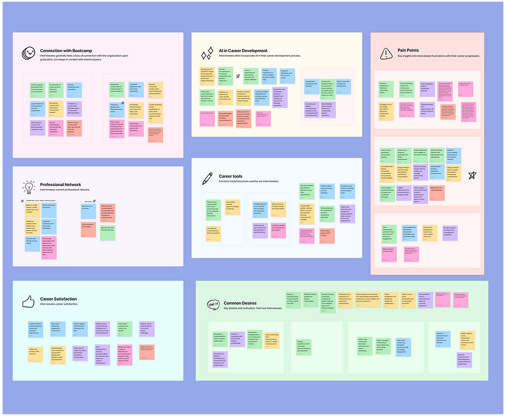
Emerged from these early conversations was a longing for care, clarity, and connection, not just tools. This emotional thread shaped KINDRED’s tone, visual language, and early features, guiding us toward an experience that felt warm, intuitive, and human-first.
To make sense of the emotions and themes that surfaced, I organized the insights into an affinity map. What unfolded was a colorful and layered journey through the emotional and logistical complexities of post-grad life. Many felt unsure where to turn after graduation, disconnected from their alma maters, and hesitant to use AI tools they didn’t fully trust. Networking, when it happened, relied heavily on familiar inner circles while leaving others behind.
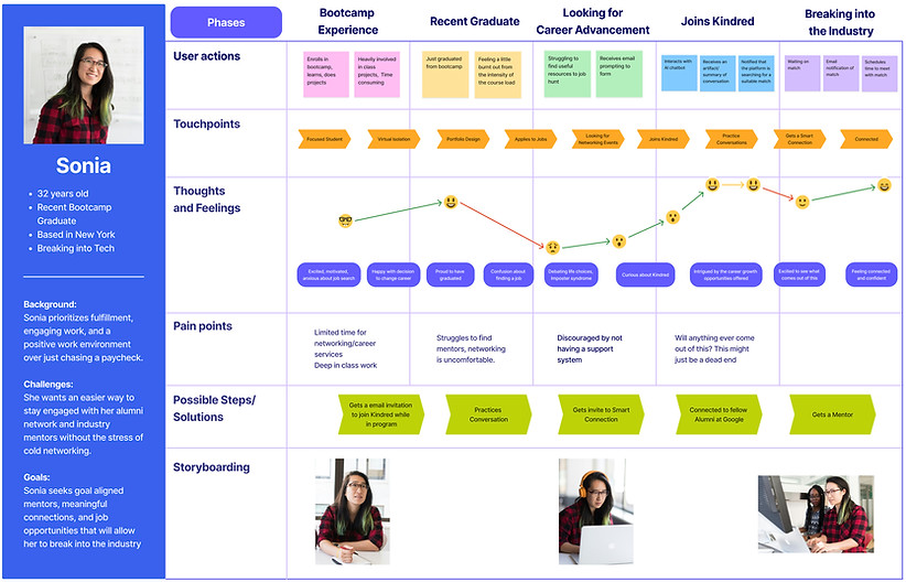
Hello Sonia!
Sonia is a mid-20s coding bootcamp graduate, determined to grow her tech career. She deeply values feeling connected and wants to learn from experienced professionals to build confidence.
"Networking has always felt like a struggle. I've looked for events in person, but I couldn't find the easily, so I gave up. It has to reach me, versus me searching."
FRUSTRATIONS
-
Struggles to find meaningful professional connection.
-
Networking feels exhausting, surface level and mentally tiring.
-
Hard to find networking events that feel valuable or accessible.
GOALS
-
Easier access to mentorship that fit with her goals.
-
Prefers guided, meaningful connections over casual or cold networking.
-
Needs deeper conversations, generic mentorship is not enough
Looking through Sonia’s lens, I was able to refine the overall design strategy into actionable insights and surface emotional touch points. Sonia’s journey illuminated critical pain points in the networking space.
To narrow down our ideas and define a clear MVP, I used the MoSCoW method to prioritize features based on what users needed most, what was feasible to build, and what would deliver the highest impact.
This alignment ensured the team stayed focused on building value early, while still leaving space for future iteration.


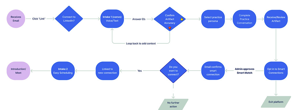
Making this vision real, we focused on two core experience pillars that consistently surfaced during user interviews: emotional resonance and ease of engagement. The goal was to create a flow that builds trust, surfaced relevant insights, and set the tone for a more human-centered journey from the very first interaction.
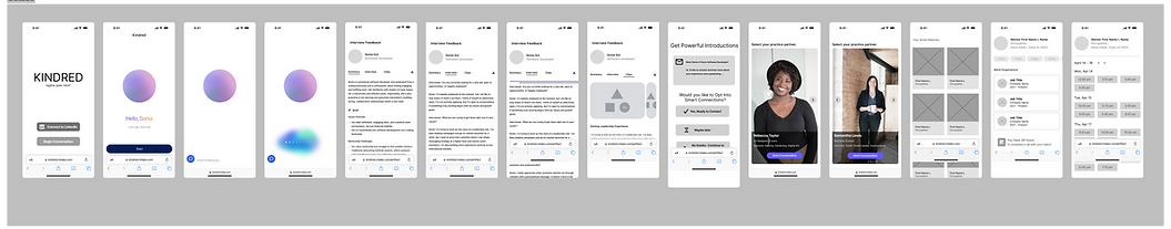
Starting with the welcome experience and a brief onboarding moment. From there, users are introduced to Smart Connections, where they can explore recommended alumni.
-
Smart Connections
Tailored mentorship matches that connect alumni with professionals based on shared interests and career goals.
-
Practice Conversations
Interactive AI personas that simulate industry-specific chats, helping users build confidence and practice networking in a safe.
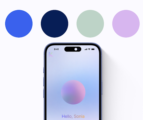
The visual design of Kindred we wanted the experience to feel, balancing warmth with intelligence.
Words like “clever,” “trustworthy,” and “welcoming” came up often in our conversations with the client as we aligned on tone and brand.
We designed a conversational interface to ease interaction and reduce friction. A clean six-column layout with ample spacing kept the focus on the dialogue, while a soft, modern color palette added warmth without distraction.

We tested information architecture, refining user flows, and validating functionality to make sure the experience would truly support our users. Below are some of the initial wireframes that helped lay the foundation.
2nd ideation

.png)
High Fidelity Protoype
Closer Look

100%
33%
66%
100%
“It felt tailored for professional connections, not just general networking.”

We spoke directly with 16 men and women through Zoom and surveys from recent graduates navigating their early career journeys and alumni 3-5 years . The objective was to uncover emotional and behavioral insights that would guide the direction of Kindred’s core features.
“The design doesn’t feel cold or corporate like LinkedIn. This feels human, like I’m actually seen.”
“The color makes me want to use it. It feels calm and friendly, like I’m in a cloud, but not the iCloud"
1st ideation

Reflection
In a fast-paced startup environment, information can easily become fragmented, leading to moments of confusion or misalignment. Regular team check-ins served as valuable temperature checks, helping us surface uncertainties, align on goals, and navigate ambiguity together.
Collaborative discovery became a powerful tool, not just for designing better experiences, but for strengthening team cohesion and shared understanding.